- All 171 upper-tier local authorities in England and Wales examined
- Wales has three of the top five local authorities with lowest numbers of deaths per thousand beds
- North East has highest numbers of deaths per 1,000 beds
- 8 local authorities had significantly more care home deaths than expected
- 5 local authorities had significantly less care home deaths than expected
- London affected in line with our expectations, but less severely than media portrayals
Following new analysis, which looks at variations in outcomes across 171 local authorities in England and Wales, Carterwood Director, Ben Hartley, explains the main findings of the research and attempts to draw some initial conclusions.
Since the beginning of the pandemic, we have scrutinised what has been happening in our sector and have published two recent articles on key data such as excess death rates and predicted recovery in occupancy levels.
As always, we need to say that statistical analysis can appear insensitive at a deeply distressing and emotional time for those directly affected by what has happened. But we hope our work is iterative and that it will contribute to longer-term informed debate and reflection, which is so needed.
Our latest work looks at spatial variations of recorded COVID related deaths in care homes for the elderly in England and Wales. The aim was to see if there was a variation in mortality rates across areas which could not be explained by natural and unavoidable variability in the observed data.
Three datasets have been used in this early stage of the analysis which are as follows:
- The total number of elderly care home beds taken from the “A-Z elderly” schema maintained by Carterwood; Publicly available data from the Office of National Statistics on the number of deaths in care homes notified to the Care Quality Commission England. The data range used was from the 10 April 2020 to 29 May 2020 and was available at the upper tier local authority level with 149 areas;
- Publicly available data from the Welsh Government on the number of deaths in care homes notified to the Care Inspectorate Wales. The data range used was from the 10 April 2020 to 29 May 2020 and was available at local authority level with 22 areas;
- Cases of COVID-19 was collected from ONS for England and Public Health Wales. These are lab-confirmed positive cases of COVID-19 in the entire population and are aggregated to the upper local authority area. The data range was trimmed and matched to the range used for both the care home death datasets.
The research was led by Andrew Whyte (Senior Analyst) and supported by Nick Evans (Data Engineer). They deserve enormous credit for their tenacity and hard work in putting this robust research together.
Read on to find out what we discovered, and if you’d like to discuss our findings or get a copy of the research in PDF form, please get in touch with Tom Hartley (Director) on tom.hartley@carterwood.co.uk or 08458 690777.
Key findings
Significant variation in COVID-19 mortality rate by local authority and region
The overall average mortality rate per 1,000 beds is 32 (3.15%) in England and Wales. Of the 171 local authorities, 32 have significantly higher than average mortality rates and 30 have significantly lower than average mortality rates.
Four of the five authorities with the highest number of deaths per thousand are located in the South East or Greater London – Reading (106), Tower Hamlets (86), Hammersmith & Fulham (79) and Berkshire (74). South Tyneside in the North East had the 5th highest number of deaths per thousand (72).
Of the five local authorities with the lowest numbers of deaths per thousand, three are in Wales – Ceredigion (0), Anglesey (4) and Gwynedd (5). The other two are North East Lincolnshire (4) and Bracknell Forest (5).
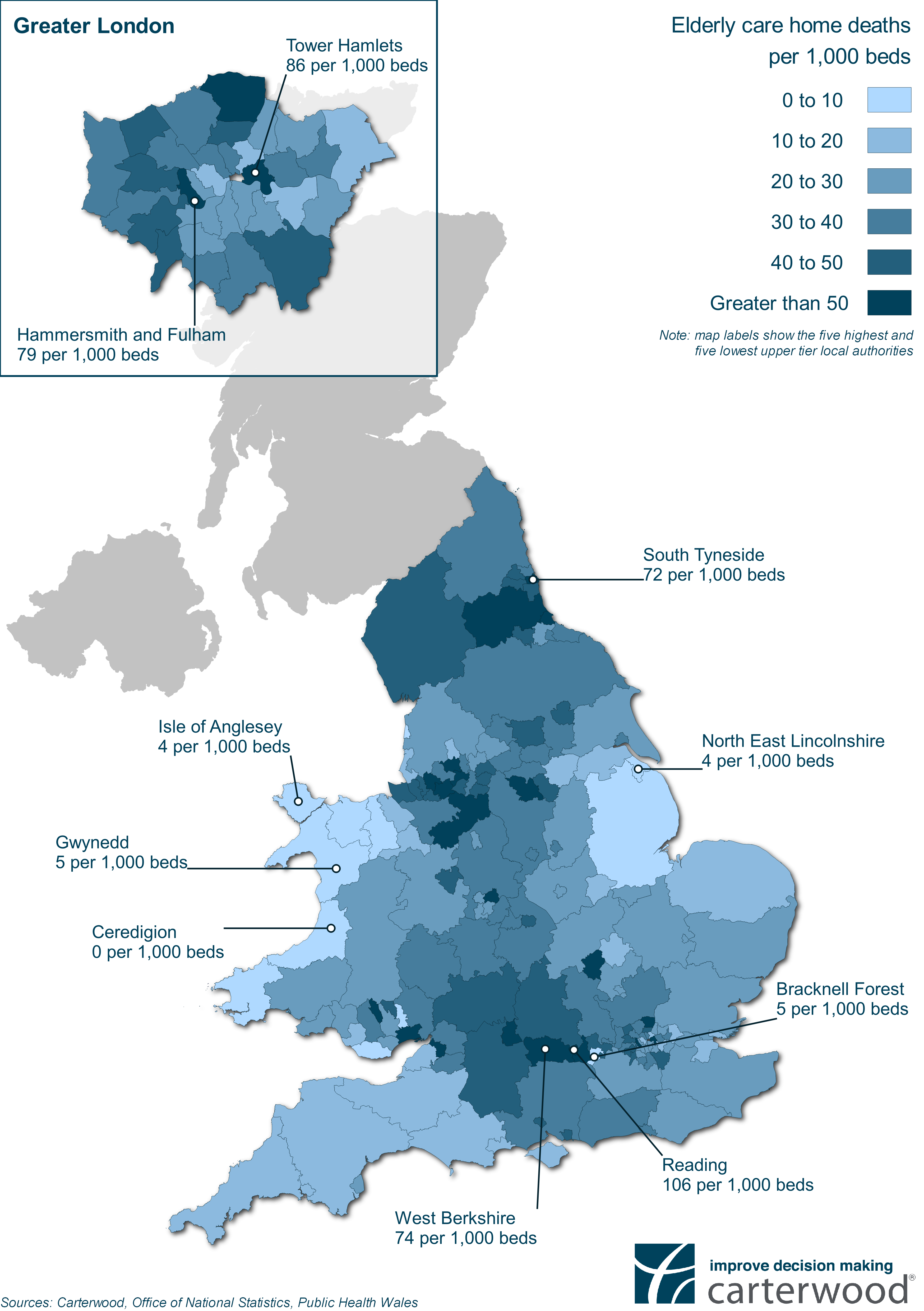
The South East has seen the largest proportion of COVID related care home deaths at 17.8% (2,015 deaths), followed by the North West (15.7% – 1,778 deaths), Yorkshire & the Humber (11.4% – 1,293 deaths), West Midlands (10.3% – 1,163 deaths), South West (9.7% – 1,095 deaths), East England (8.6% – 974 deaths), North East (8.3% – 938 deaths), London (7.4% – 841 deaths), East Midlands (7.3% – 822 deaths) and Wales (3.5% – 394 deaths).
Looking at deaths per 1,000 beds on a regional level, the most are observed in the North East with (45), followed by the North West (37), Yorkshire & the Humber (36), London (34), West Midlands (33), South East (32), South West (27), East Midlands (26), East England (25) and Wales (20).
Impact of COVID-19 relative to number of cases
To dig deeper into these numbers, Andy and Nick developed a multiple linear regression model that calculated predicted COVID-19 care home deaths when the number of lab-confirmed cases of COVID-19 in the local population is taken into account. This enabled a comparison between this figure and the actual deaths reported, highlighting local authorities where care homes have experienced significantly higher or lower mortalities than we would expect.
Results in eight local authorities were significantly worse than expected given the prevalence of COVID-19 in that authority’s general population – County Durham (+125 deaths), Sheffield (+96), Wiltshire (+91), Gloucestershire (+90), Cheshire East (+69), Hampshire (+67), Oxfordshire (+63) and Leeds (+61). In contrast, results in five authority areas were significantly better than expected – Lincolnshire (-95 deaths), Kent (-87), Norfolk (-84), Lancashire (-73) and Devon (-68).
Table 1 – Local authorities with higher than expected mortalities
| Rank | Local Authority | Number of deaths above model prediction |
|---|---|---|
| 1 | County Durham | +125 |
| 2 | Sheffield | +96 |
| 3 | Wiltshire | +91 |
| 4 | Gloucestershire | +90 |
| 5 | Cheshire East | +69 |
| 6 | Hampshire | +67 |
| 7 | Oxfordshire | +63 |
| 8 | Leeds | +61 |
Table 2 – Local authorities with lower than expected mortalities
| Rank | Local Authority | Number of deaths below model prediction |
|---|---|---|
| 1 | Lincolnshire | -95 |
| 2 | Kent | -87 |
| 3 | Norfolk | -84 |
| 4 | Lancashire | -73 |
| 5 | Devon | -68 |
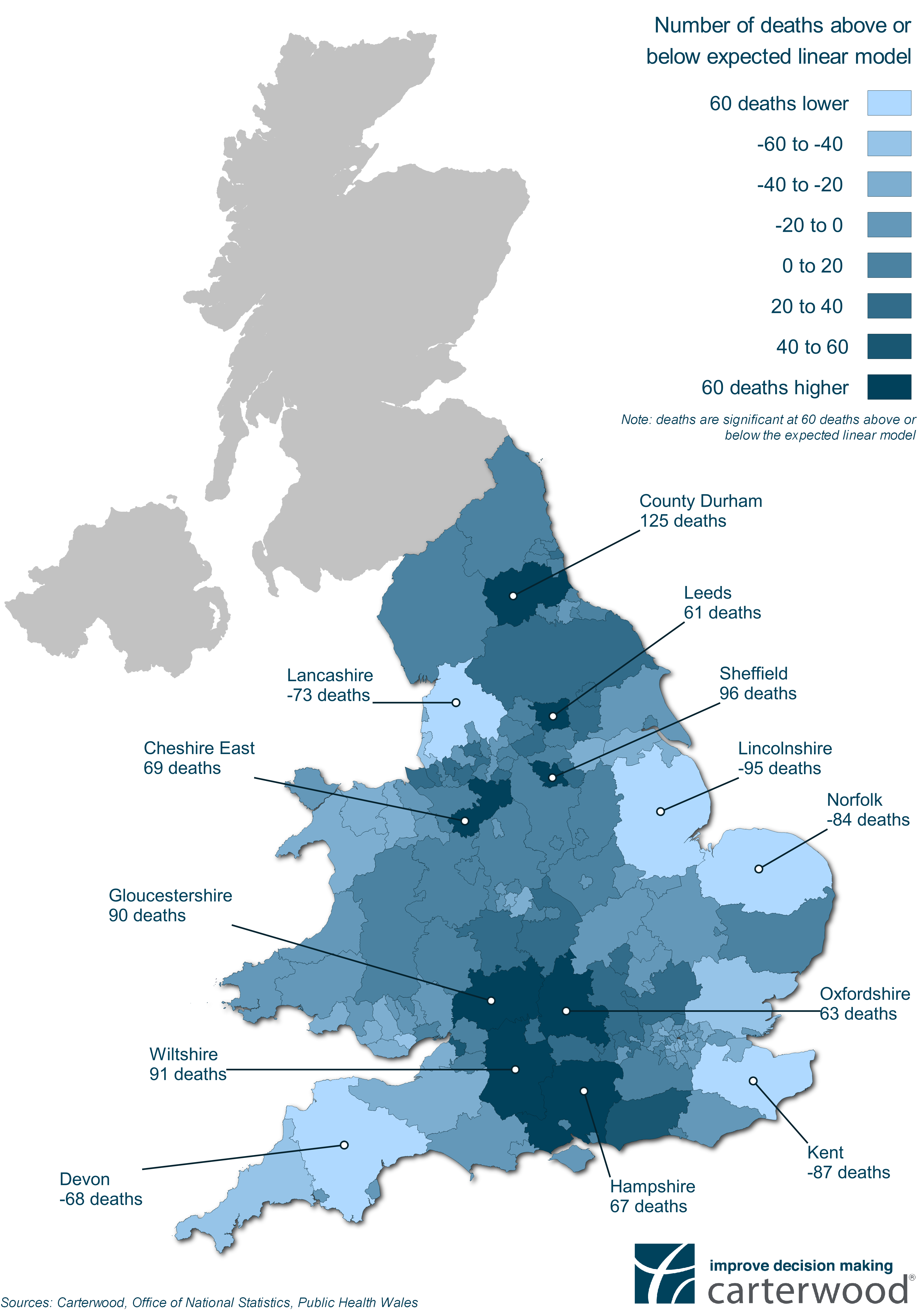
Interestingly, the five local authorities we identified in the first section of this article as having the highest mortality rates per 1,000 beds (Reading (106), Tower Hamlets (86), Hammersmith & Fulham (79), Berkshire (74) and South Tyneside (72)), have actually been impacted in line with our model’s expectations given the prevalence of COVID-19 in the general populations of those local authorities.
It’s clear that a diverse range of factors affect the impact of COVID-19 on care homes in any given local authority. At this stage we lack the granularity of data to be able to suggest definitive conclusions on why one authority might have been affected more than another. However, it is likely that the following factors, among others, played a part:
- the extent to which PPE was or was not available
- the numbers of residents transferring to care homes from hospital
- the rate at which operators isolated their homes and residents
- the sheer misfortune of having one person with COVID come into the home at a time when the impact of the virus was not well-understood and awareness nationally was low
Food for Thought
I have already made the point that we should not jump to any hasty conclusions but there are some points worth pondering.
The impact of COVID deaths seems to be partly driven by the issue of accessibility, not just population density. Coastal areas and the remote fringes have been relatively unaffected.
London has been significantly impacted at an absolute level and has two of the highest rates of deaths per 1,000 beds of all authorities assessed. But, relative to the prevalence of COVID-19 in its population base, it has actually been affected in-line with what our model would expect .
The country is split into three broad bands in terms of COVID impact. The east and west have been relatively unaffected but the middle band has taken the brunt both absolutely and relatively.
There are also some questions about the rural / urban assumption (i.e. that COVID is more prevalent in urban areas). Relatively speaking the “rural” counties of Wiltshire, Gloucestershire, Oxfordshire and Hampshire have fared significantly worse than they should have done. But major urban centres of the north such as Manchester, Leeds and Sheffield have also fared badly, both in absolute and relative terms, and these have very high population densities.
COVID is fundamentally a binary equation — care homes either have cases or they don’t. The bulk of care home deaths occurred in the early part of the process following NHS discharges without testing. When delayed discharge data is released, this will provide further insight into mapping if these discharges correlated and help to explain some of these anomalies.
Time, as always, the enemy in a crisis will ultimately serve us up with a up a clearer picture.
If you’d like to discuss our findings or get a copy of the research in PDF form, please get in touch with Tom Hartley (Director) on tom.hartley@carterwood.co.uk or 08458 690777.
Workings in the margins!
Datasets
The total number of elderly care home beds was taken from Carterwood’s core data, which we routinely maintain.
We then added together publicly available data from the Office for National Statistics (ONS), dealing with the number of deaths in care homes from 10 April to 29 May across 149 local authorities, to similar data from the Welsh Government in the same period across 22 authorities.
Data on cases of COVID was collected from ONS for England and Public Health Wales (PHW) for Wales.
Assumptions
We assumed that care homes were operating at 87.3 per cent occupancy rates across England and Wales.
The ONS data does not distinguish between age and local authority combined and so we applied a single national elderly-adjustment to both Wales and England.
It is highly probable that a range of variables are at play when assessing the mortality rates, and so it should not be interpreted that outliers in this study are performing worse or better through fault of their own actions. Of course, neither should that be assumed not to be the case.
Methodology
We used a funnel plot to visually show the clear variation by local authority and to indicate possible outliers. This technique is used extensively in the literature for examining multiple health authorities or institutions.
Alongside the funnel plot, we used a multiple linear regression model. This helped answer the question of which local authority mortality rates were better or worse than would be expected, given the two predictor variables – cumulative laboratory confirmed cases in the entire population and the total number of elderly care home beds at 87.3% occupancy.